During the week an engineer from France reached out to me via LinkedIn asking if I could share the Grafana dashboard for pfSense that I screenshotted in my post on connecting Prometheus to pfSense via SNMP. As it happens I’ve just been making updates to that dashboard so it’s a good time to share the code and explain how to adapt it.
You can get the Grafana dashboard code for this dashboard from here: dashboard.json
The details of the dashboard are very specific to my environment in terms of network interfaces and hosts so it’s not a drop-in solution, but with an understanding of how it works it’s trivial to customize it to your needs.
To recap - this dashboard shows network statistics pulled from my pfSense router by Prometheus via SNMP. Actually it also shows stats from key interfaces on my UniFi 24-port managed switch similarly obtained via SNMP.
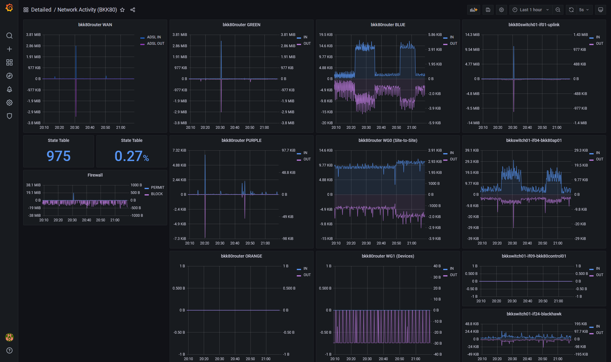
There’s a bit going on here but there’s only three distinct types of content:
- Network traffic - showing the traffic in and out from an interface - this accounts for most of the panels
- pfSense State Table - the number of tracked states and the percentage of state table memory used
- Firewall Actions - showing the number of bytes passed or blocked across all interfaces
Let’s look at each in turn and how to customize the dashboard:
Network Traffic
In my dashboard there are several network traffic panels, which are all the same but just for different interfaces:
- bkk80router WAN
- bkk80router GREEN
- bkk80router PURPLE
- etc
As a side-note - many many years ago my first homelab firewall was based on Smoothwall where interfaces are usually described as GREEN, RED, etc. I still use that terminology out of habit although I’m considering changing it to improve the readability of my firewall rules. GREEN is LAN, PURPLE is trusted WiFi, BLUE is IoT WiFi,etc.
Each network panel shows octets (8-bit bytes) in and out with in colored blue and out colored purple and both plotted from a common zero axis but with independent vertical scales - this is so that when there’s a lot of traffic in one direction, you can still see the peaks on the other. It does mean you need to pay attention to the Y-axis scales which may not be to everyone’s liking but it’s how I want to see the data:
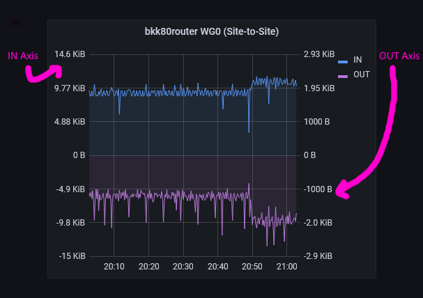
If you want both directions to use the same scale you can move the OUT metric to the left axis.
Note that I’m still using the now-legacy Graph visualization and not the newer Time Series visualization because although Time Series supports dual (actually multiple) axes, I haven’t been able to get get it to center zero yet but I will be updating my dashboard once I figure that out.
Each network panel has two queries, one for IN and one for OUT like this:
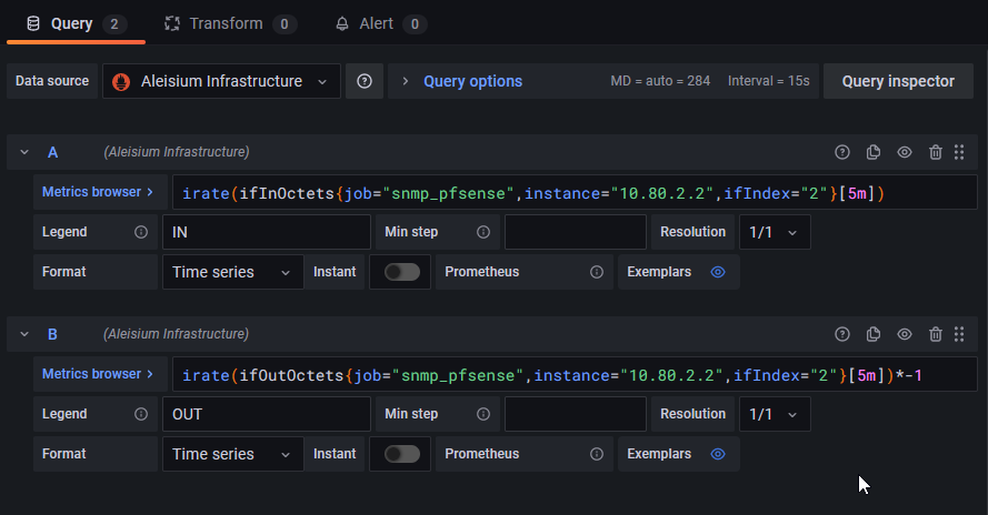
These queries are very similar:
# IN
irate(ifInOctets{job="snmp_pfsense",instance="10.80.2.2",ifIndex="2"}[5m])

# OUT
irate(ifOutOctets{job="snmp_pfsense",instance="10.80.2.2",ifIndex="2"}[5m])*-1
For IN we’re doing an irate() of ifInOctets and for OUT of ifOutOctets. We filter on the job and instance labels to get to the right device (in my case either my pfSense box or my UniFi switch) and then ifIndex (interface index) for the specific interface we want to monitor.
Note I am using irate() not rate(). irate() works off the last 2 metrics regardless of window size and rate() works off the entire window. If you prefer you could do a rate() of a small window - say 30s - e.g.:
# IN
rate(ifInOctets{job="snmp_pfsense",instance="10.80.2.2",ifIndex="2"}[30s])
The question is how do we know what to use for ifIndex? You can find out the index of each interface by querying for ifDescr in your Prometheus console:
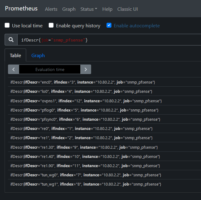
Here we can see that, for example:
- re0 - my WAN interface is index 1
- re1 - my LAN interface (aka GREEN) is index 2
- re1.90 - VLAN tag 90 on my LAN interface which is my IoT WiFi network is index 11
- tun_wg0 - my WireGuard site-to-site VPN is index 7
- etc
Now that you know the index, it’s easy to adapt the queries above to show the data for the interface you’re interested in.
pfSense State Table
In the early days of my adoption of pfSense I had a performance issue that seemed to be correlated to a state table with more than 2% utilization - for that reason I wanted to have this in my dashboard.
I have two stat panels - one showing the number of states and the other showing the utilization of the state table:
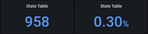
The count of states is obtained from one of the pfSense-specific SNMP metrics:
pfStateTableCount{job="snmp_pfsense",instance="10.80.2.2"}
While the utilization is the percentage of the total size:
pfStateTableCount{job="snmp_pfsense",instance="10.80.2.2"}/360000
360000 is hardcoded as it’s not available from a SNMP metric. I got this number from the pfSense console:
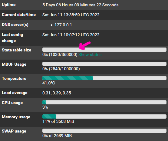
This does vary based on RAM so check your state table size and update as appropriate.
Firewall Actions
Firewall actions are shown on a two axis graph similar to the network activity graphs, with PASS traffic in blue and BLOCK traffic in purple.
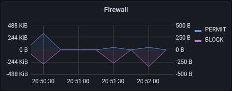
The queries are:
# PASS
sum(irate(pfInterfacesIf4BytesInPass[5m]))

# BLOCK
sum(irate(pfInterfacesIf4BytesInBlock[5m]))*-1
Conclusion
This network dashboard gives me a high-level idea of what traffic volume looks like on my home network. If I see something interesting in this high-level view and want to know the details then the next step would be to take a look at the pfSense state table to see recently passed traffic, or run a packet capture in pfSense or remotely with Wireshark over SSH into the router.
Let me know if this helps you or if you notice bugs or have ideas to improve it. In the future I may do another update as I continue to enhance it for my needs.